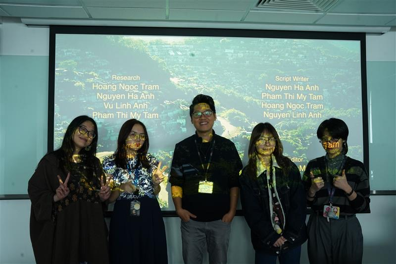
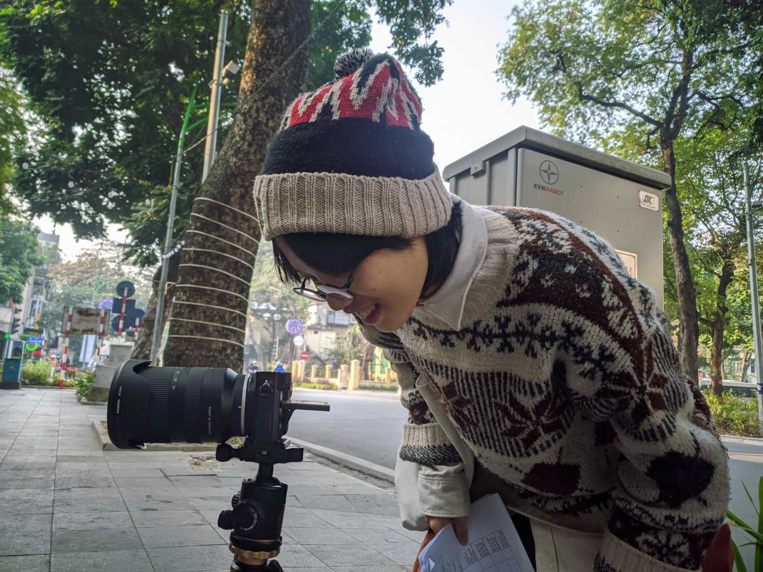
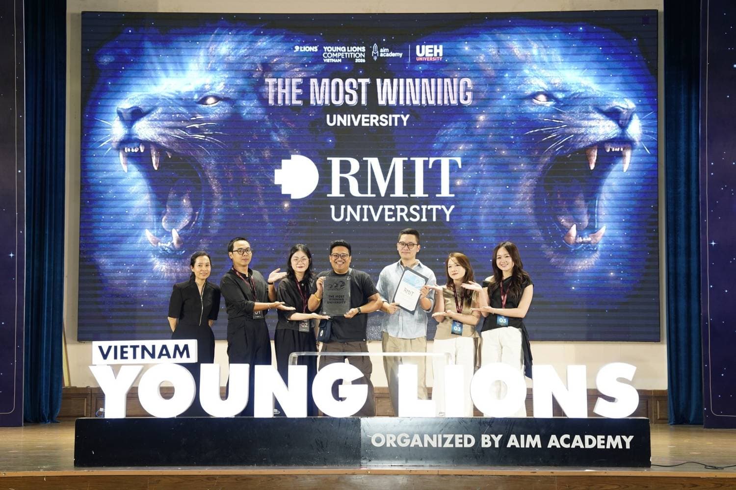
Inside RMIT students’ creative breakthroughs at Vietnam Young Lions 2026
Vietnam Young Lions is more than a contest for many emerging creatives, it’s a proving ground for young minds with big ideas. This year RMIT students answered that call with courage and creativity, turning pressure into growth: across multiple categories they earned top honours, including two Golds in the Film category.
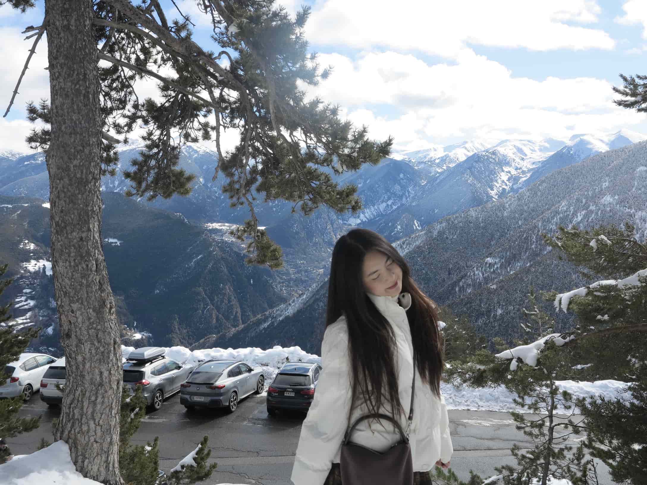
First-year student embraces Barcelona exchange experience from Erasmus+ scholarship
What started as a first year at RMIT Vietnam soon turned into an unexpected journey across continents for Nguyen Thuy Duong. Through the Erasmus Scholarship, she traded familiar classrooms for a new student life studying at CETT, a leading higher education school affiliated with the University of Barcelona, Spain.
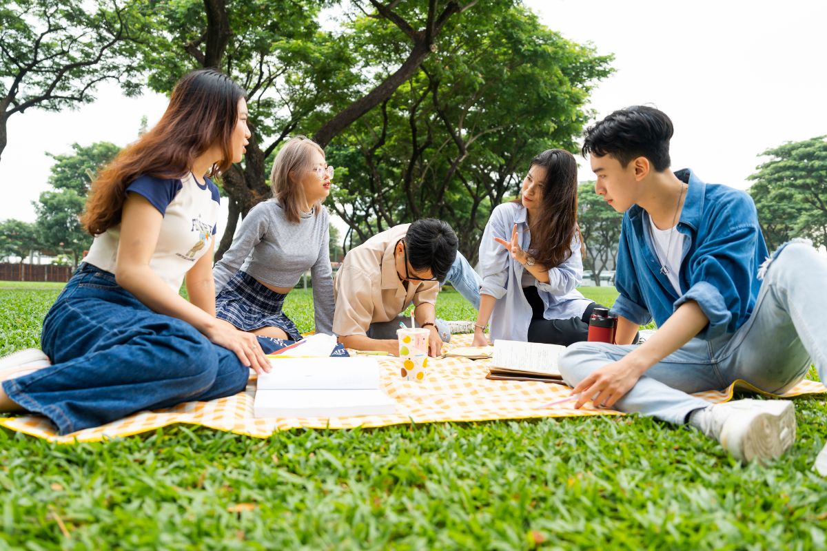
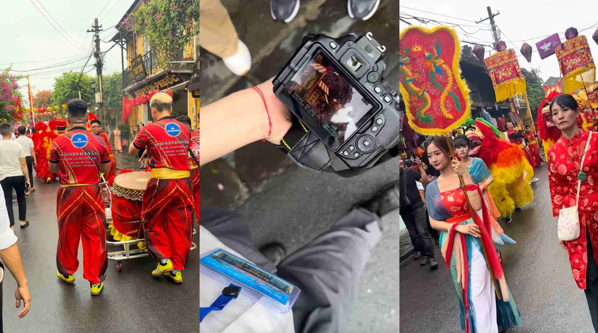
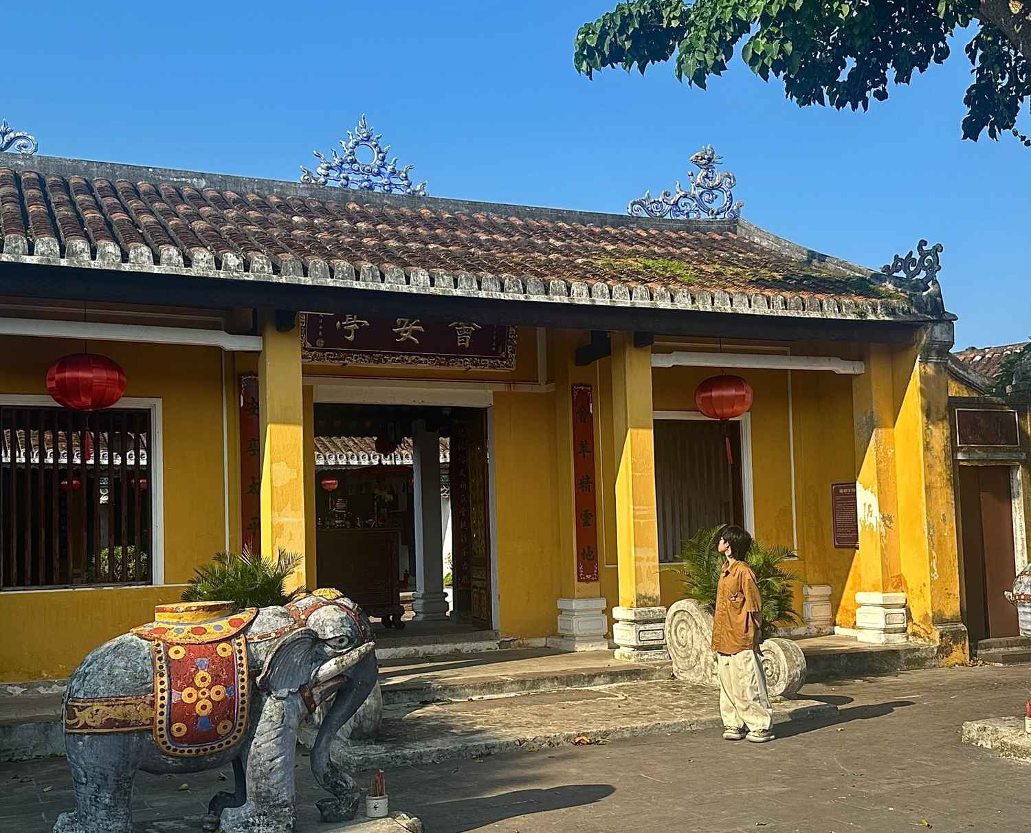
What to do during the semester break?
After weeks of deadlines and late-night study sessions, it’s finally time to let your hair down. But breaks aren’t just for Netflix binges and late mornings. At RMIT, students are turning their time off into a mix of rest, skill-building, and new adventures, proving that growth doesn’t stop when classes do.