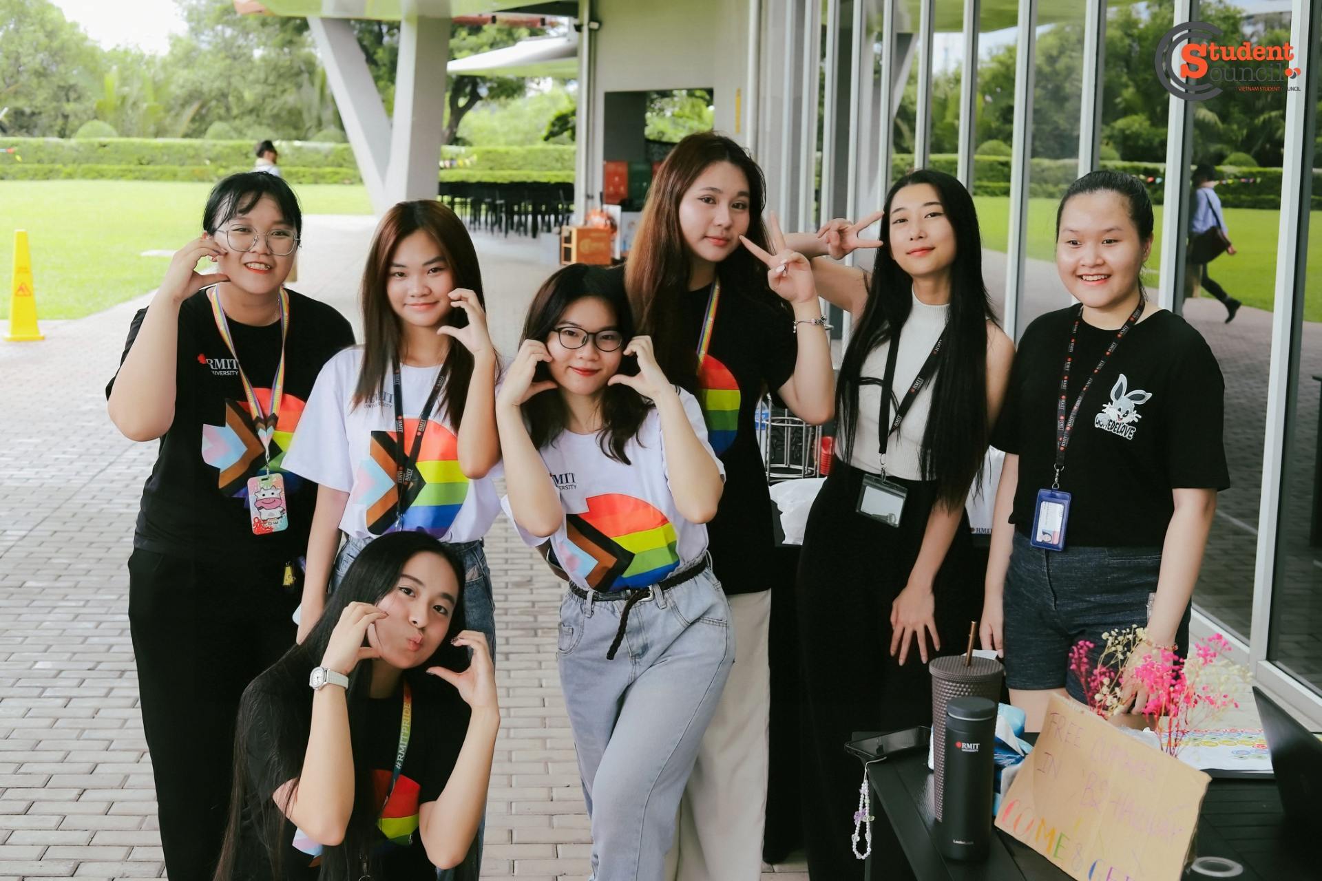
As RMIT Vietnam prepares to celebrate Pride Week 2025 from 25 to 29 August, the university proudly shines a spotlight on its commitment to inclusion, diversity, equity, and accessibility (IDEA). Central to this celebration is the launch of the IDEA program’s new visual identity: a vibrant symbol of RMIT Vietnam’s ongoing journey to foster a culture of belonging for all students and staff. And behind this fresh new look is the creative vision of one of our very own students, whose passion for design and community has left a mark that everyone at RMIT can see.
The IDEA program, led by RMIT’s Equitable Learning and Accessibility (ELA) team, is all about promoting inclusion, diversity, equity, and accessibility across the university. Until now, the framework in Vietnam has not really had a distinctive or recognisable brand. The rebranding became a chance to change that and to give IDEA a fresh look that feels more engaging and closer to the student community. And fittingly, this new identity was shaped with the creativity of Hang Tran, an RMIT student. Beyond the visuals, it’s designed to spark conversations, raise awareness, and inspire more students and staff to get involved in building a culture of belonging, as outlined in the IDEA Framework 2023–2028.
At the heart of the IDEA’s new look is Tran Thi Thuy Hang, a Digital Media student and aspiring artist whose creativity and passion helped bring the new identity to life. Hang first became involved in the project through a personal connection, a close friend who introduced her to the opportunity. What motivated her to take it on was more than just the chance to design: she was driven by the joy of helping people in need and her desire to contribute to the development of the RMIT community. “My motivation for this project is the joy of helping people in need and contributing to the community,” Hang shared. “It was also a great chance for me to practice in a professional setting with a real client, ‘anh' Simon.”
“Art is a crucial part of my life,” says Hang, “and being involved in the IDEA project gave me the opportunity to learn more about how design can promote meaningful change. As a student familiar with educational challenges, I wanted the logo to be more than just a symbol. It had to communicate openness, warmth, and the spirit of belonging.”
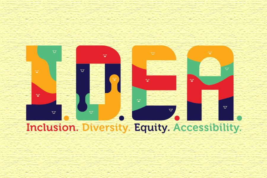
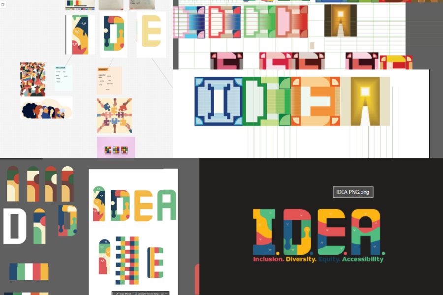
Hang dedicated over 4 days to this creative endeavour, blending technical skills with thoughtful reflection on what inclusion truly means. Through multiple rounds of revisions and feedback, she developed a key visual that features rounded shapes and a warm colour palette symbolising accessibility, friendliness, and diversity.
As Hang explained, the organic shapes within the letters were designed to capture the dynamic, ever-changing nature of the community. The colour palette combines RMIT’s signature red and blue with two expanded tones: light yellow and saturated green, to represent diversity and a broader sense of belonging. While she initially considered including six or seven shades to reflect the wide spectrum of identities, including those in the Pride flag, the final four colours achieved a balance between inclusivity and visual harmony, thanks to close collaboration with the brand manager.
Hang admitted that one of the biggest challenges was translating abstract ideas of inclusion and equity into a visual form that felt both approachable and professional. “For the creative process, I actually had a lot of ideas for the logo. From more illustrated, artistic versions to designs that conveyed friendliness,” she shared. After many rounds of feedback and modifications, she decided to focus on the letter elements, allowing people to clearly recognise Inclusion, Diversity, Equity and Accessibility within the name itself.
Reflecting on the journey, Hang added, “Looking back, the challenges only made the project more meaningful. I hope this new look sparks a sense of connection within the RMIT community and supports the university’s collective story.” For Hang, this project was more than a design task. It was a step toward her aspirations as an artist and designer, showing how creativity can make a real difference in the community.
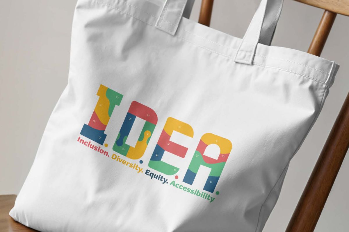
The IDEA branding initiative encompasses more than just a new key visual. It includes a range of digital and physical assets such as posters, brochures, social media content, and event materials, all designed to engage and inspire members of the RMIT community.
The launch of the IDEA visual identity reflects RMIT’s ongoing commitment to inclusion, diversity, equity, and accessibility, values that are evident across the university’s initiatives and actions. This commitment will also be visible during Pride Week 2025, where stories like Hang’s, alongside the lived experiences and voices of students advocating for inclusion, will be shared through student communication channels. Staff will also be engaged through tailored communications, reinforcing a shared culture of respect and belonging across campus.
As RMIT Vietnam celebrates Pride Week in parallel with the IDEA Framework, the university reaffirms its dedication to empowering every voice, breaking down barriers, and building futures where everyone feels they truly belong.
Join us in Pride Week 2025 as we celebrate the rich diversity within our community and the bright future IDEA promises for all at RMIT Vietnam.
Story: Nguyen Minh Chau, a Professional Communication student at RMIT Vietnam. This article does not reflect the views of RMIT Vietnam.